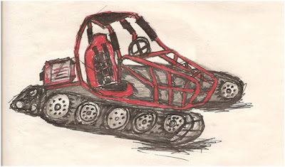
The first Concept Image. I know, painful to look at.
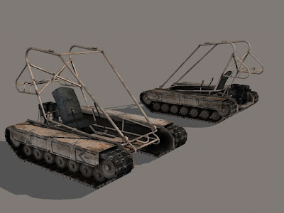
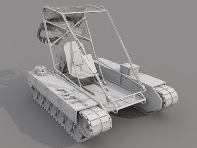
 Current Base Mesh Renders:
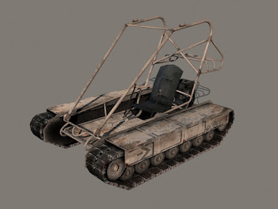
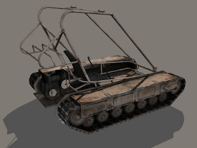
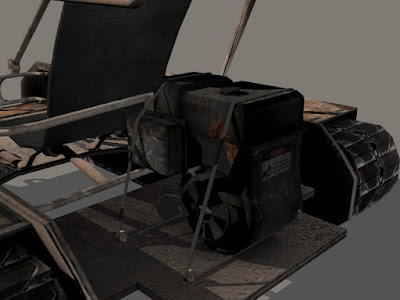
High poly:
Still plan on adding detail, particularly fuel lines.
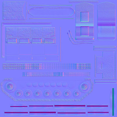
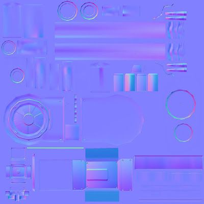
Normals:
I combined my detail normals w/my baked normals for the main elements at the moment. I'm probably still going to tweak these and adjust the intensity of the detail map because at the moment it looks like some meteors hit my rover based on how deep some of the grainy detail is.
Also the side panels I had to go back and make them jet out from the armored plating further to accentuate that detail so the normals would show them better. When I applied the normals with my diffuse map initially all of the detail disappeared so I had to make them more pronounced.
Diffuse Maps:
I've made a little progress on these. I've updated the wheels since I've gotten the normals baked out and added some rust areas. I had a questions as to what the material of the chair was. It's supposed to be a wooden seat with some leather material pulled tight over the seat and stapled at the back, which I plan to texture this onto the back of the chair in the diffuse map later on.
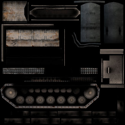
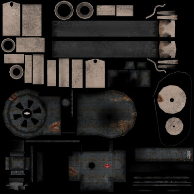
Specular Maps:
Simple black and white maps that I'm not going to upload to save time and space since it's easy to just imagine the diffuse maps desaturated. However at the moment I haven't really done any tweaking to the spec maps, so I plan on going in and actually getting levels that I like later on.
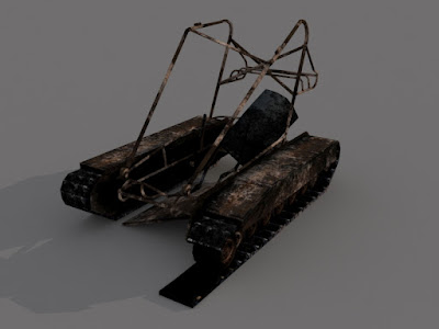
Damaged Rover:
I haven't touched this since I showed it. I will go back eventually and update it. Finished damaging it and tweaking the texture...like adding the normal maps and making sure that the texture itself is based from my most recent diffuse maps so it doesn't look like the entire vehicle didn't change upon being destroyed.
Looks pretty awesome. I really like the speed at which you were able to make this while still making a quality piece with many uses.
ReplyDeleteIts looking great with that texture on there. I love all that detail! You should add more decals on it, ones that are functional so it seems more practical and like it is being used in real life situations. look at other vehicles similar to this for reference because I don't really know what they would have on there I just think it would look cool with more on it.
ReplyDeleteOne more thing I would like to see is some more wear on the vehicle that reflects its actual task like scratches that follow the direction it moves and other damage that shows how it is used like where people have been siting in it and stuff like that. I like the general grime on it but it seems to generalized.
Awesome Work. The working model looks pretty complete from my point of view. My comments on the damaged model are the same as when you first showed it, so work on that some more. Other than that, I'm really struggling to find a fault.
ReplyDeleteLooks great. I have no advice for what to fix, don't see anything wrong, but for the sake of portfolio, you could do a half wireframe, half shaded render.
ReplyDeleteLooks great I really like the overall look of it.
ReplyDeleteYou're going to get a job for sure.
ReplyDeleteI think to place your model into the environment you're imagining will help your diffuse details fit more with the state of your model.
Thanks for the feedback everyone. I'm pretty critical of my own work so I was feeling kinda neutral about this piece. I'm glad others like how it is turning out.
ReplyDeleteWinston- good ideas. I actually remember early on I was thinking of doing a painted on decal that military people add to abarams tanks and the airforce adds to their tanks. I'm going to look into that again. I'll also look into the wear and tear and see what I can come up with. Thanks for the constructive feedback...everyone.